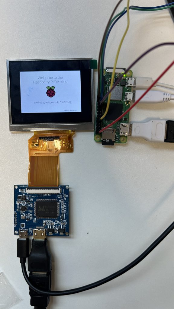
This week, all four screens are wired and set up on Raspberry Pi Zero 2 W. As shown in the image below: the breadboard on the left contains the photoresistor and Analogue-Digital Converter (ADC). On the right, there is the Raspberry Pi Zero 2 W and the screen.
Then, the acrylic pipes were painted in dark colour and the circuit was placed in the pipe to test and calibrate the lighting.
This is the final blog for this project—it feels surreal. After nearly half a year of researching, planning, sculpting, coding, animating, and refining, this week was all about bringing every single piece of the puzzle together.
Putting the installation together felt like both a culmination and a celebration. It was a strange feeling: nervous excitement mixed with a little anxiety. I kept thinking, What if something goes wrong? What if the electronics don’t work or the sculpture looks off? But once I started fitting each piece into place—slotting in the coral elements, installing the screens, wiring the circuits, and arranging the periscopes—the nerves slowly faded into satisfaction and pride.
Seeing the digital content come alive inside the periscopes was honestly magical. After weeks spent staring at these animations and visualisations on my laptop, it felt amazing to finally watch them as intended—in context, integrated into the physical sculpture. The first moment I triggered a video just by peering into the periscope was a real highlight for me; it felt genuinely interactive and brought home the sense of curiosity and discovery I had hoped for.
Because of the lighting and reflections on the magnifying glass, it was difficult to flim it. But this result really motivates me to get all four periscope working with four circular screen. Hopefully I can purhcase them for the graudation showcase.
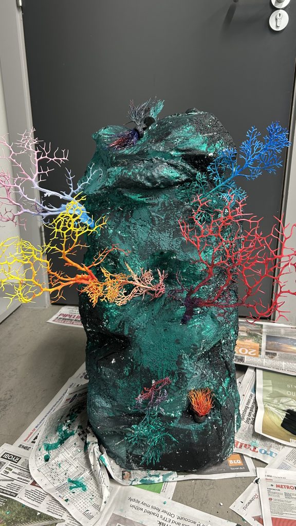
The sculpture itself took on a whole new life when everything was assembled. The coral elements, crafted carefully over hours, blended naturally with the polystyrene structure. It all somehow worked together, creating something cohesive and meaningful.
Reflecting on the final result, I’m proud but also reflective. The project turned out beautifully, yet there are always small things I’d love to refine. The screens could’ve been larger, or maybe the coral could’ve been a bit more detailed. But I also realise that’s part of the creative process—knowing when to step back, embrace imperfection, and let the work speak for itself.
Reflection
Looking back over the entire journey, this project pushed me to grow in ways I hadn’t anticipated. I’ve developed skills I didn’t even know I needed, like navigating new software, managing technical troubleshooting, and refining my sculpting techniques. But the biggest takeaway, perhaps, is how much I’ve learned about balance: balancing technology and nature, aesthetics and functionality, ambition and practical constraints.
This process taught me that creativity is not linear or predictable; it’s messy and iterative, full of mistakes, adjustments, and unexpected breakthroughs. I’ve learned to embrace uncertainty, to trust the journey, and to accept that a good project isn’t about perfect execution—it’s about how effectively it communicates an idea or a feeling.
Most importantly, finishing this installation reinforced why I chose this project in the first place. I wanted to invite people to reflect critically on our complex relationship with nature and technology. I wanted to create an experience that’s not only visually compelling but also thought-provoking and meaningful. And in the end, I truly believe I’ve achieved that.
Now, stepping back and looking at the completed installation, I feel grateful and fulfilled. The project has become more than just an academic exercise—it’s become something I genuinely care about, something personal and meaningful. It’s been an incredible journey, and I couldn’t be happier with where it’s brought me.
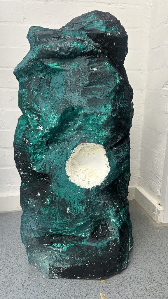
This week I continued to work on the sculpture. Starting with drilling holes for the periscopes. There are 5 holes in total: 4 for each periscope, and one in the middle to connect them all together to the bottom. This deep hole is for power supply and headphone cables to go through without exposed outside to cause disturbance.
Then I started to put corals onto the polystyrene base. And wrap the sculpture with modroc to smoothen the surface and improve its durability.
After modroc, the sculpture was painted with acrylic paint. The tone changes from side to side indicating the health condition of the “marine ecosystems”, connecting to the digital content inside the periscopes.
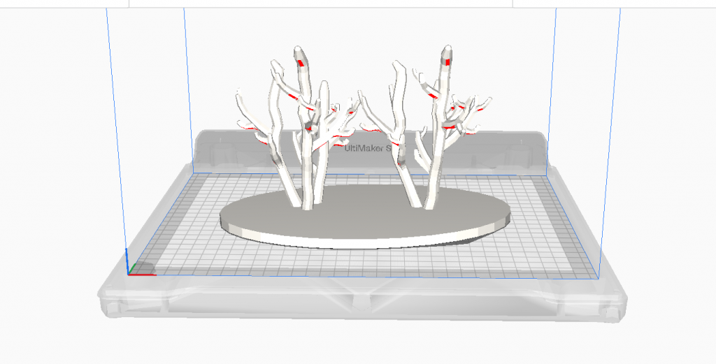
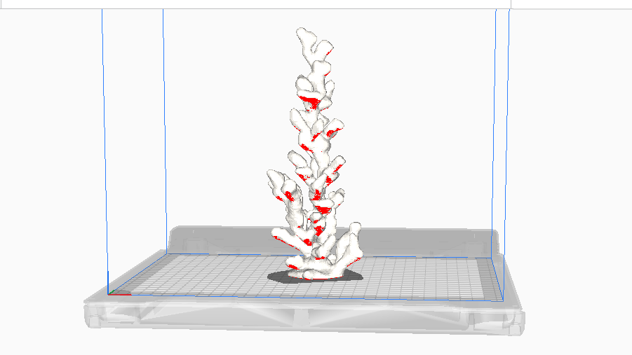
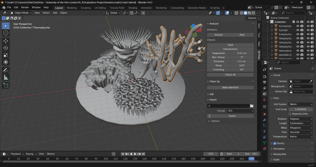
Continuing the coral fabrication process from last week. The initial coral model was too complicated to print, therefore I made more models for 3D printing.
After consulting with the digital fabrication technician, the new models will still be challenging to print as they generally require a large amount of helpers which needs to be removed by hand after. So I decided to further simplify the model and make sure it is feasible to print.
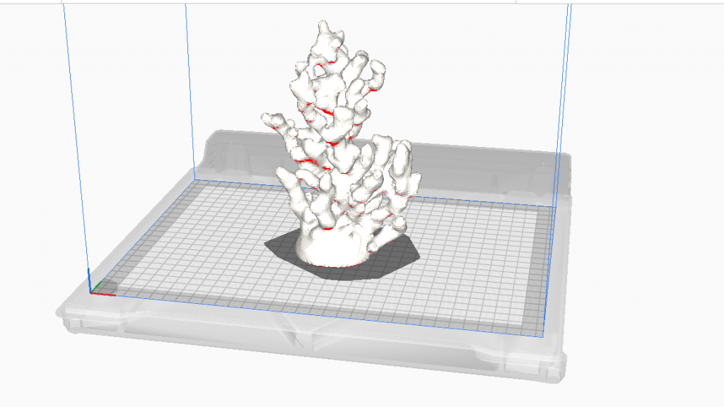
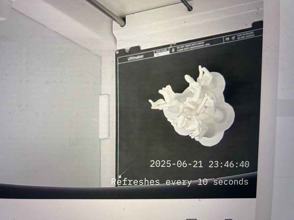
The first print turned out broken. I analysed the problem with the technician and modified the models to do a reprint of the broken coral.
The second print failed too. Since I removed the bottom plate to save the printing time, it is cruicial to have a flat buttom for the corals. Not having a perfectly flat bottom caused one of the branches to fall during the printing and messed up the rest of the printing.
After more fixing on the models, the print was finally successful.
This week was all about bringing the physical side of the project to life — finally making the sculpture!
Polystyrene Base
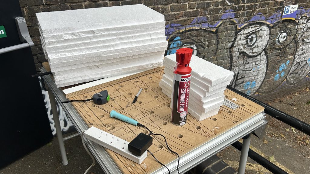
After weeks of planning and experimenting, I decided on using polystyrene as the base material. It’s lightweight, affordable, and relatively easy to shape, which made it the most practical choice for a large installation like this. Even though I had initially considered other materials like clay or chicken wire, in the end, polystyrene seemed to be the best option.
Once the material was sorted, I got to work cutting the sheets down to size. My goal was to build a 300mm x 300mm x 800mm cuboid, which would serve as the main body of the sculpture. Using a hot wire cutter, I sliced the polystyrene sheets carefully. It was bad at first because the cuts needed to be precise, and I didn’t want to waste any material. I made sure to do all the cutting outside for safety.
After cutting, I glued the sheets together using expanding foam. This part was messy but kind of satisfying! Once glued, I clamped the whole structure tightly and let it dry overnight. Seeing it come together as a solid block made me feel like the project was really materialising in front of me.
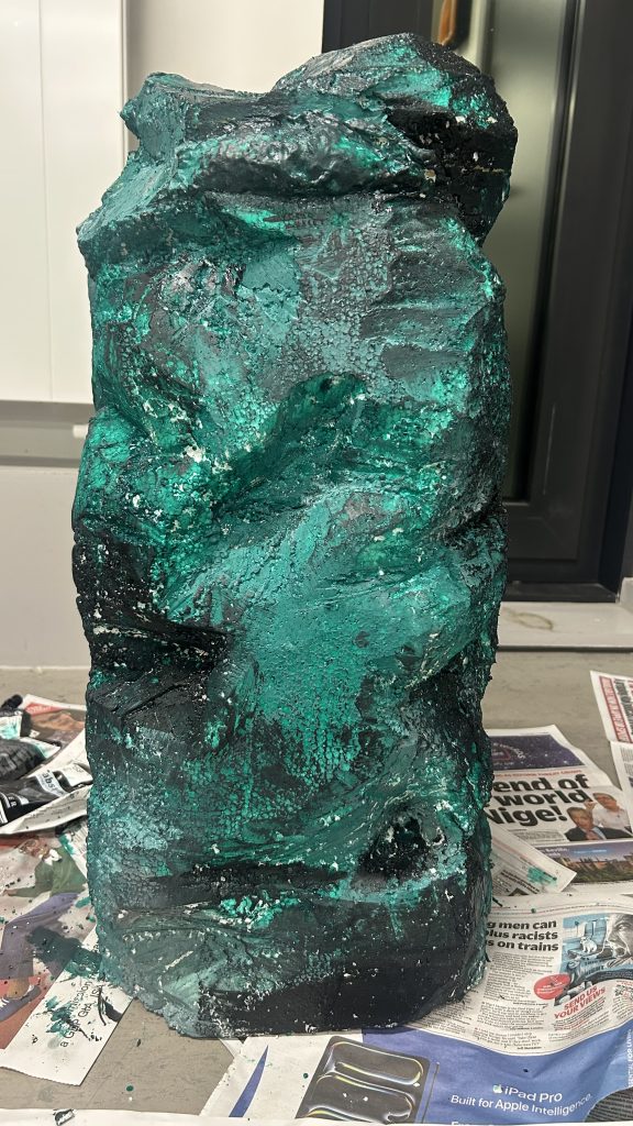
The next phase was shaping the sculpture. I used a combination of hot wire, a saw, and a box cutter to carve and refine the form. This was probably the most hands-on and physical part of the process so far. I took my time, adjusting the curves and angles to make sure the shape matched my design vision. Then I cut out the holes for the periscopes, circuits, and coral elements, getting everything ready for the final assembly.
To finish the surface, I wrapped the whole structure in Modroc — this not only smoothed it out but also added durability, which was important since other materials like the periscope pipes with screens and circuits, and the coral elements will all be add to this piece. Finally, I painted it with layers of acrylic, bringing in colour and texture to help it resemble the underwater world I wanted to evoke.
Coral Elements
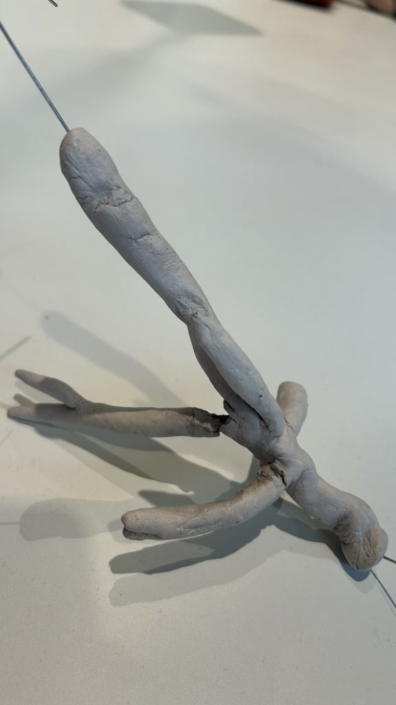
One of the most detailed and delicate parts of the project was making the coral elements for the sculpture. Originally, I had planned to buy real coral pieces, thinking they would bring authenticity and texture to the installation. But after researching the sources, I realised it wasn’t the right choice — not just because of the high cost, but also because of ethical concerns. Using real coral for an artwork that’s supposed to raise awareness about marine restoration just felt wrong and contradictory. So I decided I would craft the coral myself.
At first, I thought 3D printing would be the perfect solution. I had the digital models ready and consulted with the fabrication technician, only to learn that the intricate, delicate shapes of the coral models would be nearly impossible to print without major redesigns.
That was a bit of a letdown, but it also forced me to get creative and hands-on. I pivoted to using air-dry clay, which turned out to be a really rewarding (if sometimes frustrating) process.
I began by colouring the clay using acrylic inks, which took more time than I expected because I needed to prepare large amounts in different shades. Sculpting the coral forms was both fun and challenging — the small pieces came together quite easily, but the larger, more branched models were trickier. Even with some added armature, they were often too heavy and fragile, and I had more than a few break on me during or after shaping. That was definitely frustrating at times, but it also made me understood the material limits.
In the end, I decided to combine the two approaches: smaller, delicate pieces made from clay, and larger elements 3D printed with simplified forms. Seeing them all arranged on the sculpture, I felt proud of how they came together — each piece adding texture, shape, and meaning to the final installation.
Reeflection
Reflecting on this week, I feel both exhausted and proud. This was probably one of the most physically demanding parts of the project, but seeing the sculpture come to life has been incredibly rewarding. It’s no longer just an idea or a digital plan — it’s something real, something you can walk around, touch, and experience. Making the coral elements reminded me why I care so much about this project in the first place. I understand their beauty and delicacy even more. It’s never just about aesthetics; it’s about telling a layered story that invites people to think, question, and feel.
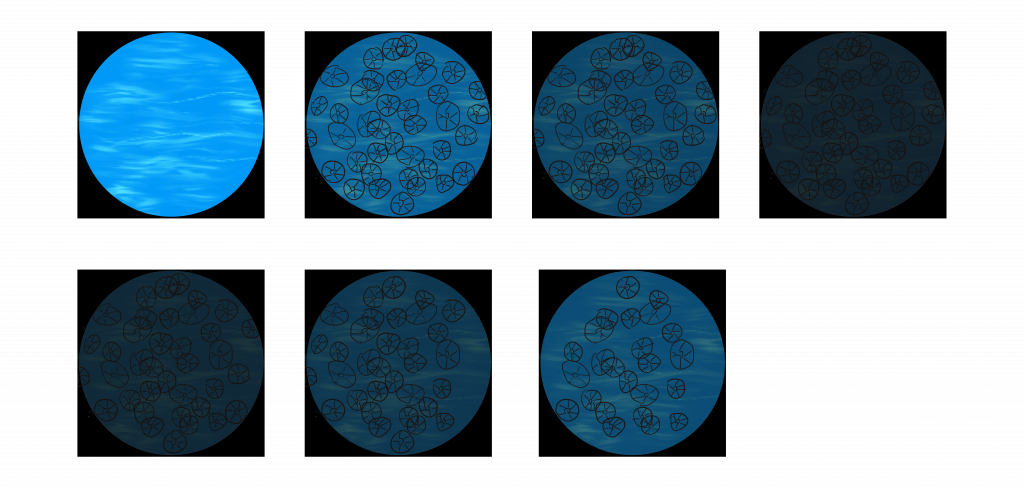
This project, I worked on the two data visualisation animations to tell the contrasting stories of two artificial reef projects: one successful case in Pulau Weh, Indonesia, and one failed case at the Osborne Reefs in Florida, USA.
As the content will be played on a small screen, any statistic or numbers will not be readable. The goal was to move beyond static graphs and numbers, creating more visual stories that show transformation over time — inviting viewers to feel the ecological impact in an intuitive, engaging way.
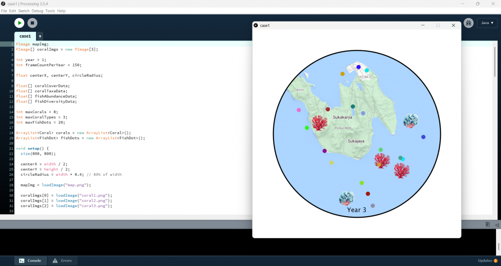
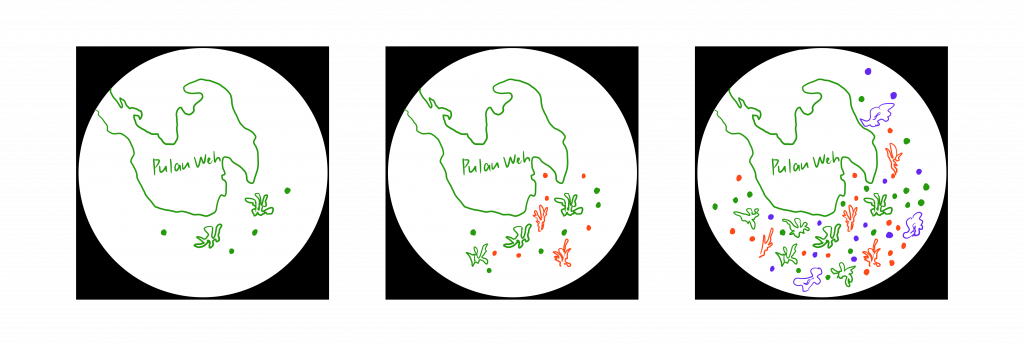
Screen 2: Successful Case (ARs in Pulau Weh, Indonesia)
The Pulau Weh animation visualises the recovery and transformation of artificial reefs over three years, using real monitoring data on coral and fish life.
Here’s how it works:
Circular Map Canvas: To provide the periscope effect, the animation needs to takes place on a circular map of the Pulau Weh reef site.
Coral Data as Images: Coral cover percentage is translated into the number of coral images (small coral PNGs), with the number of coral taxa determining how many different types (species) appear. Over the three years, viewers see the reef filling in and diversifying, reflecting the real improvements in coral health.
Fish Data as Colored Dots: Fish abundance is represented by dots scattered across the coral area, while fish diversity is shown using a range of dot colors. Over time, the dots increase in number and variety, visualising the boost in fish populations and biodiversity.
Smooth Year-to-Year Transitions: The animation cycles through the first, second, and third year, allowing viewers to directly see the positive trajectory — a small reef area growing into a thriving ecosystem.
This visualisation celebrates ecological restoration and highlights how well-planned artificial reefs can support marine biodiversity.
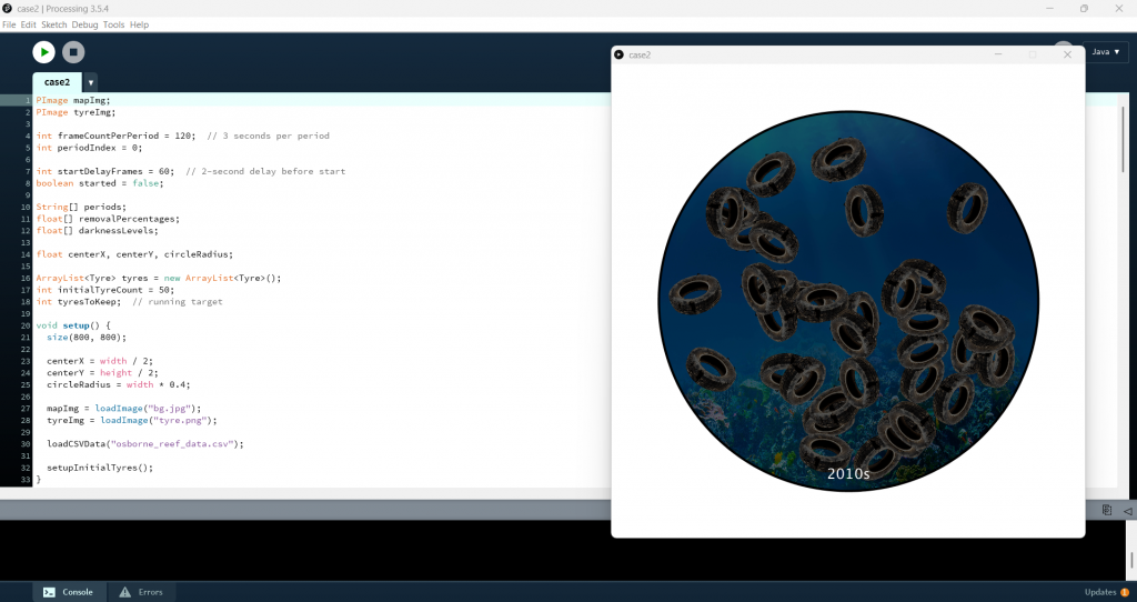
Screen 3: Failed Case (ARs in Broward County, Florida, USA)
In contrast, the Osborne Reefs animation visualises the failure of one of the world’s most infamous artificial reef projects: a site where over a million old car tires were dumped into the ocean in the 1970s — with horrible consequences.
Here’s the approach:
Circular Map Canvas: Again, the animation uses a circular canvas, this time showing a scene underwater.
Tyres Implementation: The animation begins by placing 50 tire images across the canvas, representing the dumped tires.
Darkness Overlay: To symbolise ecological degradation, a semi-transparent black overlay darkens the scene decade by decade — increasing from 35% darkness in the 1970s to 80% blackness by the 1990s.
Cleanup Efforts and Lightening: Starting in the 2000s, some tires are gradually removed based on real cleanup data (e.g., 1% removal in the 2000s, 23% in the 2010s, 34% in 2020-2024), and the overlay lightens accordingly, visualizing partial recovery.
Time Labels: A time label on the canvas marks each decade, guiding viewers through the decades-long environmental story.
This visualisation communicates the weight of environmental failure and the challenge of undoing ecological damage once it’s done — reinforcing the need for careful planning and long-term thinking.
Reeflection
Looking back on this week, I’ve realised translating numbers and facts into something visual and emotionally engaging was definitely not easy. I kept finding myself caught between accuracy and aesthetics: I wanted the data to be meaningful and clear, but I also wanted the visualisation to feel alive, to tell a story, not just display statistics.
One of the biggest things I learned this week is how important pacing and clarity are. If too much is happening on the screen at once, it’s overwhelming. If too little happens, it’s boring. Finding that sweet spot took a lot of trial and error. I also found myself thinking a lot about audience perspective — how will someone with no background knowledge read this visual? Will they understand what it’s showing? Will they care?
I’m starting to see how all the pieces of this project connect and how the digital elements can really amplify the core message if I get them right. It’s been a demanding process, but I’m proud of the progress so far.
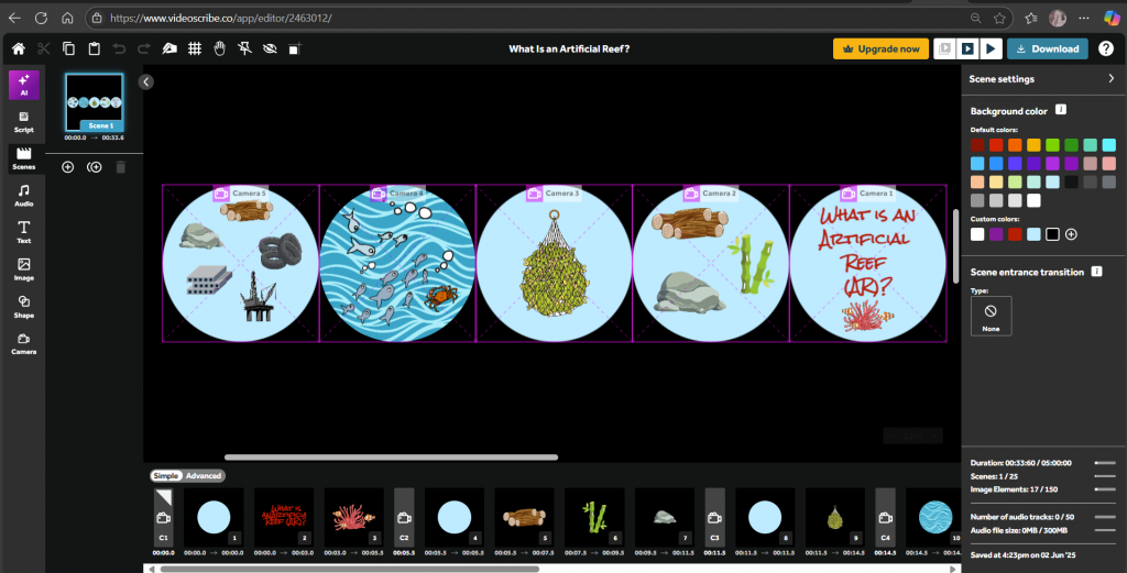
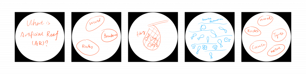
This week I focused on developing the videos for my installation. The introduction screen titled What Is an Artificial Reef?, and the last CTA video.
Screen 1: What is an artificial reef (AR)
I wanted the first screen to set the stage: to explain, simply and engagingly, what ARs are, where they came from, and why they matter. I didn’t want it to feel like a dry educational lecture, but something to draw people in, spark their curiosity, and make them want to learn more. So, I chose to use VideoScribe to create the animation. I’ve never used it before, but I really liked its hand-drawn style — I thought it could help make the content feel more lively and playful.
I followed the storyboard we planned: the animation opens with the question, What is an artificial reef? I wanted to immediately invite the audience to wonder, not just tell them. From there, the video moves into a brief history, showing how early artificial reefs were created using simple, available materials like bamboo, stones, and wood — mostly to improve fish-catching.
Then how this practice has transformed over time, evolving into a more deliberate environmental technology aimed at marine restoration. I listed some modern materials used today, like concrete, steel, and even sculptures — which are designed specifically to attract marine life and help rebuild damaged ecosystems.
It was challenging to fit all this information into such a short, clear visual flow, but I’m happy with how it’s coming together.
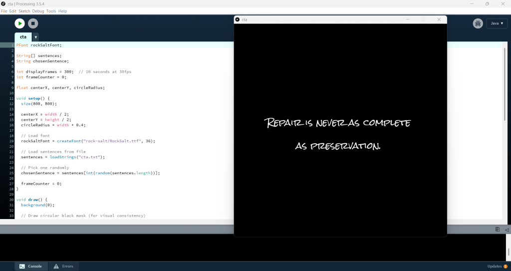
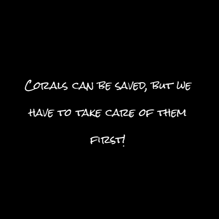
To wrap up the series of artificial reef visualizations, I wanted to create a simple but striking Call-to-Action (CTA) screen. This final animation delivers an important message by randomly displaying a short sentence (like a conservation message or call for awareness) in a bold, visually centered way.
Here’s how the animation works:
Randomly Selected Sentence: The CTA messages are stored in a simple .txtfile (one sentence per line). Each time the program runs, it randomly selects one sentence from this list — ensuring variety and surprise with each viewing.
Custom Font (Rock Salt): To keep the consistancy in fonts, I used the Rock Salt font, which is the same as the font I choose in VideoScribe. This adds personality and draws attention compared to a generic system font.
Center-Aligned Multi-Line Text: Since some sentences are longer than others, the animation intelligently wraps long sentences into multiple lines. I wrote a custom function that calculates how to split the sentence into lines that fit within the circle’s width, then centers the entire block both horizontally and vertically. This ensures that no matter the length of the message, it looks balanced and aligned inside the circular space.
Timing: The message stays visible for 10 seconds, giving viewers enough time to read and absorb it without rushing. After that, the screen fades back to blank, creating a clean, meditative ending.
Reeflection
There were definitely a few frustrating moments — like when the software didn’t do exactly what I wanted, or when a section just didn’t feel smooth. But overall, this part of the project really energised me. Seeing the screens come to life made the whole installation feel more real.
Next week, I’ll dive into developing the data visualisations for the successful and failed reef cases. I know it’s going to be technically tricky, but I’m excited to experiment and see how I can translate these stories into moving, meaningful visuals.
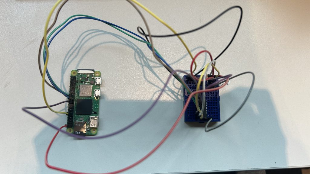
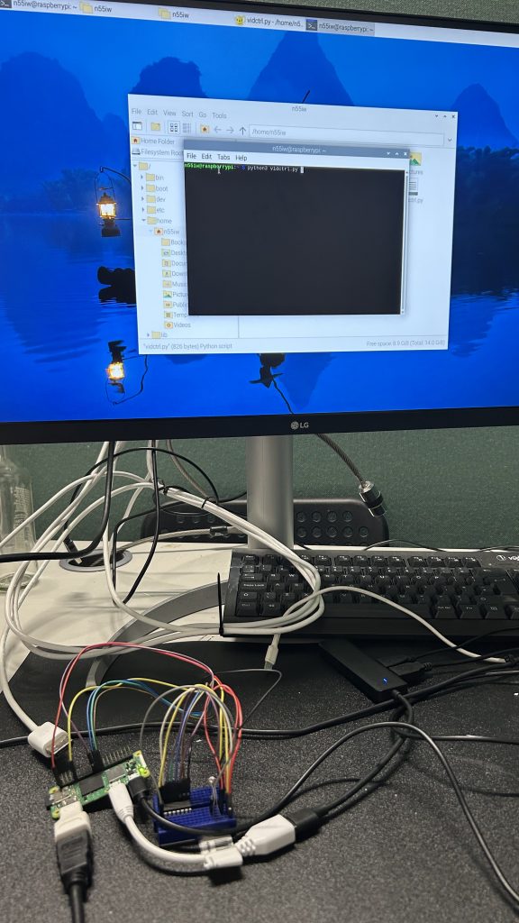
This week I worked on how to built a system where a Raspberry Pi Zero 2 W plays a video on an HDMI screen when a light sensor detects low light. No keyboard, no monitor, no manual start required.
Gathering Components
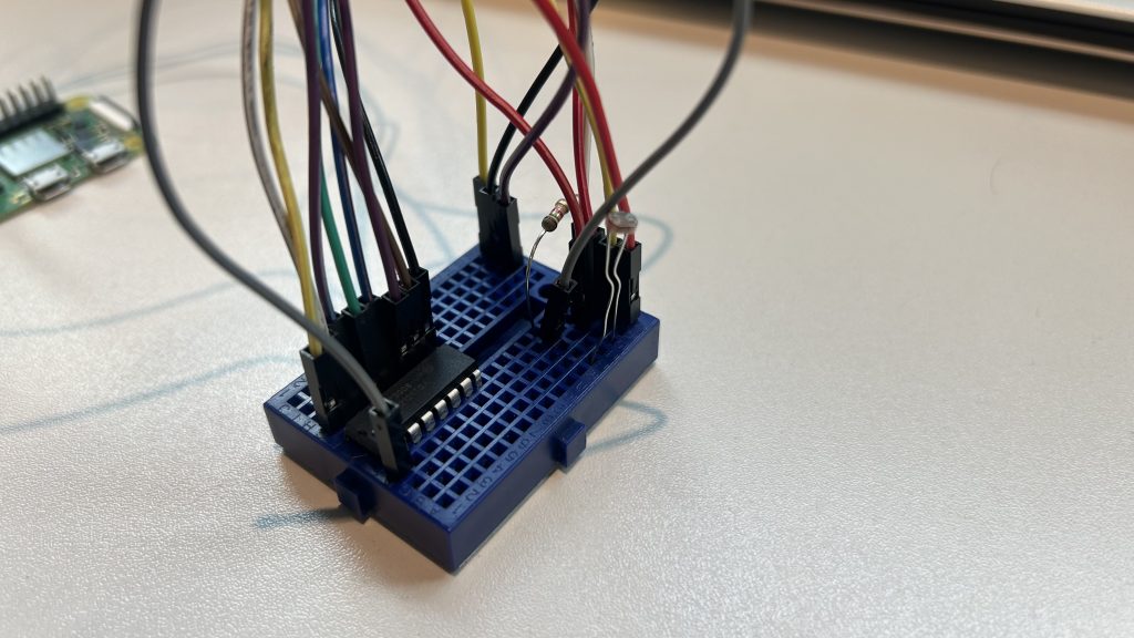
I picked a photoresistor (also called an LDR, or light-dependent resistor) for one key reason: simplicity.
A photoresistor changes its resistance based on the light it receives:
Bright light → low resistance
Low light → high resistance
Why this sensor?
It’s inexpensive and widely available.
It doesn’t require complex circuits or components.
It perfectly fits the “is it light or dark?” question I wanted the Raspberry Pi to answer.
For my project, I only needed to detect when something covered the sensor (like a hand or an object), and the LDR was ideal.
The Raspberry Pi’s GPIO pins can only handle digital signals (high or low). But the photoresistor outputs an analog signal (a smooth voltage change depending on light).
To bridge the gap, I added an MCP3008 analog-to-digital converter (ADC). This chip:
Reads the varying voltage from the LDR + resistor voltage divider circuit.
Converts it into a 10-bit digital value (0 to 1023).
Sends it to the Raspberry Pi over SPI (Serial Peripheral Interface).
Without the ADC, the Pi couldn’t read the subtle changes in light intensity, only an on/off threshold.
Test Circut with LED
Before jumping into video playback, I wanted to make sure the electronics worked.
I wired up an LED and wrote a Python script:
If the light sensor reading was below a set threshold (i.e., low light), the LED turned on or blinked. If the light was above the threshold, the LED stayed off.
This step was critical for: – Confirming the LDR + MCP3008 circuit worked. – Testing the Python SPI communication on the Pi. – Making sure my threshold values were calibrated.
Once I saw the LED responding reliably to my hand covering and uncovering the sensor, the system was ready for the next stage.
Working with Raspberry Pi
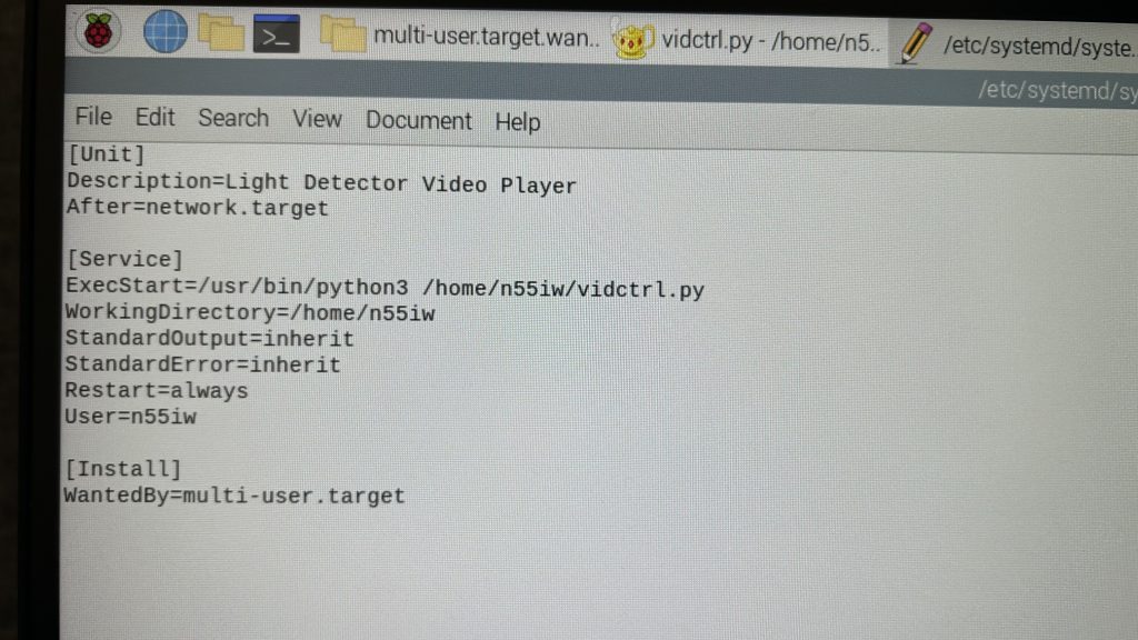
Next, I replaced the LED control with a system command to play a video.
From that point on, the script ran automatically every time the Raspberry Pi booted, with no manual commands needed.
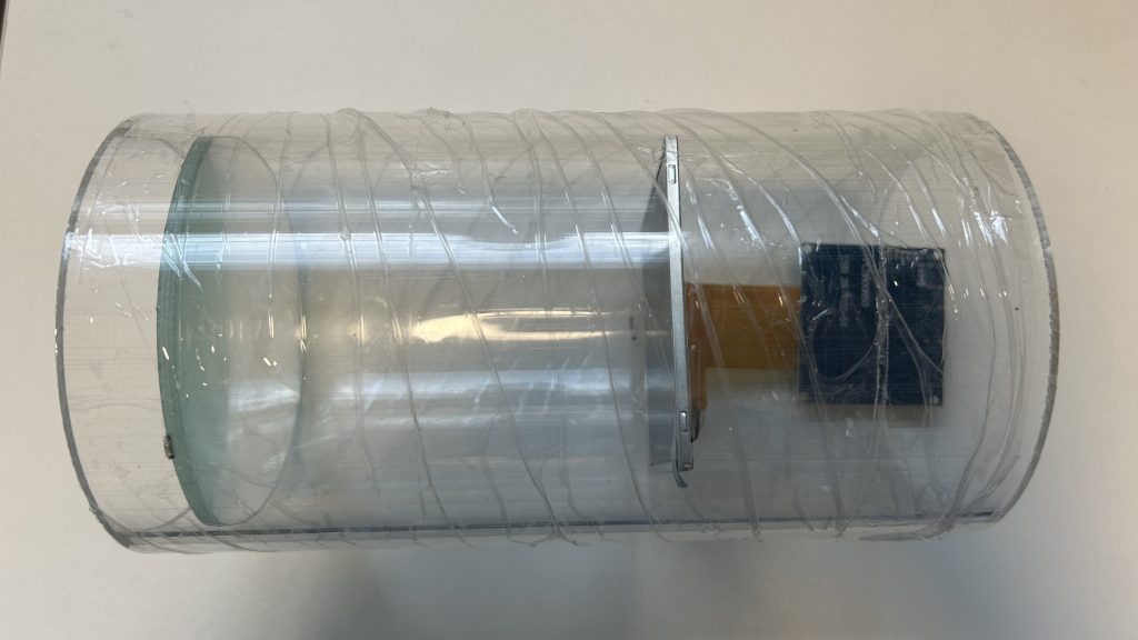
Placing the Screen and Magnifying Lens
To give the illusion of a larger display, I used a magnifying glass in front of the small round screen. But this setup required careful calculation.
First, I determined the magnification factor. I used a 3x magnifying lens, meaning the virtual image would appear 3 times as large. This magnifier has a specific focal length, calculated as:
P (Magnifying Power) = 1 + 25/f (Focal Length)
In my case the focal length is 12.5 cm.
To make sure the image appeared sharp and magnified:
I placed the screen just inside the lens’s focal length, so it produced a virtual, upright magnified image.
I positioned the viewer (eye) as close as possible to the magnifying lens to get the widest field of view.
I tested by adjusting the distances along the pipe:
Screen to lens: slightly more than the focal length (13cm)
Lens to eye: close to the eye, 2 cm.
This gave the audience the illusion that they were watching a much larger display, even though the physical screen was smaller.
These distance calculations were critical to avoid blurry or distorted images and to maximise the visual impact of the magnifier setup.
Reeflection
This week was full of technical hurdles but also small victories. Setting up the Raspberry was challenging at first, especially since I hadn’t used it before. But successfully getting the sensor to trigger the digital content was incredibly rewarding. It made me realise how much I enjoy the intersection of physical and digital experiences. While I hit plenty of frustrating obstacles, this week taught me patience, resilience, and the joy of finally making something work.
This week marked an exciting turning point in my project. After weeks spent deep in research and planning, I finally got to sit down and start visualising the actual content for my installation.
At first, I felt a bit stuck. I knew clearly what messages I wanted to communicate, but translating that into short, engaging visuals was trickier than I’d planned. I wanted to avoid making something overly academic or dull—I needed the content to be engaging, clear, and visually interesting enough to capture people’s curiosity.
Screen 1: Introduction
I started by sketching out rough storyboards by hand. Having everything on paper made it easier to rearrange and rethink the flow of each screen’s content. Screen 1 (introducing artificial reefs) was particularly important—it needed to set the tone for the entire experience. I spent quite some time experimenting with different ways to introduce ARs, aiming to balance clear explanations with an intriguing, open-ended question.
Screen 2: Successful Case
This screen felt important because it was about conveying optimism. I wanted viewers to see the positive impacts artificial reefs can have. I struggled initially to translate complex data into a straightforward and visually appealing narrative. Eventually, I chose an animated map style that would show the gradual growth of coral cover and marine life around the location over time, reinforcing a message of hope and possibility.
Screen 3: Failed Case
In sharp contrast, the third screen presented a cautionary tale. It dealt with ecological failure and human error. Finding the right visual approach to communicate the impact clearly, without sensationalising or trivialising the tragedy, took careful consideration. I ended up choosing visuals that emphasised the environmental consequences—tyres piling up underwater, pollution increasing—to create a powerful yet thoughtful statement.
Screen 4: CTA
Finally, the last screen had a slightly different role. It needed to summarise and inspire the audience to think. I wanted it to feel simple yet powerful. After multiple iterations, I included a strong call-to-action message that appeared randomly, prompting visitors to reflect personally and emotionally on their role within the broader ecological context.
Reeflection
Reflecting on this week, I realise just how important it is to consider audience experience in every creative decision. Storyboarding and wireframing reminded me that every detail—from colour choice to pacing—can significantly shape how an audience engages with the work. It’s rewarding to see my ideas finally materialise, making the project feel even more tangible and real. I’m excited (and slightly nervous!) to see how it all continues to evolve in the coming weeks.
This week was all about preparing for my formative assessment presentation.
The biggest challenge was figuring out what to focus on. There’s just so much going on in this project: the environmental angle, the ethical tensions, the technological components, the artistic expression. How do I communicate all of that clearly, without overwhelming the audience or making it sound like a jumble of disconnected pieces?
I spent a lot of time this week organising my materials — sorting through sketches, photos, notes, and research summaries. Laying everything out made me realise how far I’ve come, but also how much still feels unresolved. For example, the balance between the educational side of the project and the artistic side is something I’m still figuring out. Should the installation be more didactic, offering clear facts and information, or should it lean into abstraction, letting the audience draw their own interpretations? I kept circling back to that question as I built the presentation slides.
Even though the formative assessment is meant to be a check-in and not a final judgment, I still felt the pressure. Sharing unfinished ideas is vulnerable — you’re opening up your half-formed thoughts and hoping people will see potential rather than flaws. But at the same time, I reminded myself this is exactly why feedback is so valuable. You need outside eyes to spot the gaps you’re too close to notice.
Once the slides were ready, I rehearsed my talking points a few times, which helped calm my nerves a little.
Looking back, I agree that it is important to spend some time to pause and reflect. It forced me to take stock, clarify my direction, and articulate the heart of the project.
Project Name
I had a few options. Then I narrowed down to these three:
Second Nature/Reefs: second nature was my original idea to show that artificial reefs are like a 2nd chance that human get to repair what we’ve destroyed, but second reef makes it clear that this is about reefs specifically.
Reeflections: uses a word play to show this is a reflective piece on the relationship among human, technology and nature. Also sort of hinting the main interaction is to look into the periscopes to see what’s behind.
Manufactured Ocean: the marine ecosystems are harmed by the manufactured products yet the artificial reefs that are designed to restore the ecosystem made from material from those products. eg: tyres, steels, etc.
I asked for my friends and supervisor for advise and I decided to have “Reeflection” in the end.
Reeflection
Preparing for the formative assessment was both stressful and enlightening. It forced me to clearly articulate my ideas and confront the weaker points in my project head-on. Presenting unfinished ideas was intimidating, but it turned out to be incredibly valuable. The feedback I received highlighted areas I hadn’t fully considered, especially around narrative and coherence. This week reinforced how important external perspectives are in refining and strengthening my work.